
something fishy across the pond


i acknowledge readily that i leave out the commentary on most posts nowadays; despite the fact that i know there are new readers all the time, and that even those who have been reading this blog for a long time, and pretty regularly, are likely to have never read the whole thing, i get tired of repeating myself. i feel didactic. nevertheless, i think some exposition is now called for.
but first.... not since edward penfield playfully stole from many of the famous artists of his day have we seen the kind of trickery of v l danvers of the work of ohara koson. for example see above; where ohara koson called his image 'carp and fly,' (note the location of the flies) danvers reiterates the theme while punning on the word 'fly'! now before ed chides me again, i must admit to the ohara images, both of them, have been flipped for illustration purposes. the arc of each fish is even quite similar.

 we see this same game recreated in danvers's second 'sporting' poster; the mallards. in an experiment i tried, i was able to prove to myself that the necks and heads of the male duck in both images is the identical angle.
i was interested to learn that both artists were active during the 1920s; danvers was following, in these posters and those in the previous post, as well as those of many japanese-influenced artists and illustrators of the age, many of the elements of the japanese prints, while dropping some others. you will still see the japanese-y signatures, asymmetry and background items, but more importantly, you will get the areas of flat color while losing the outlines.

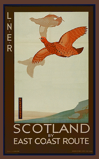
 in 'small town,' you can see this even more clearly than in the examples here, but studying that one will inform your viewing of this one. my argument falls apart entirely. the closest i could come, which isn't that close, is allen seaby's, though he was earlier. (toshi yoshida also did grouse, but his are not flying, and to me they look like babies, but what do i know?

 danvers' cormorant is his most realized example of japonisme. there too i could find no 'original.' his mastery of the form is now obvious. perhaps he no longer had a need to borrow.

 we see this same game recreated in danvers's second 'sporting' poster; the mallards. in an experiment i tried, i was able to prove to myself that the necks and heads of the male duck in both images is the identical angle.
i was interested to learn that both artists were active during the 1920s; danvers was following, in these posters and those in the previous post, as well as those of many japanese-influenced artists and illustrators of the age, many of the elements of the japanese prints, while dropping some others. you will still see the japanese-y signatures, asymmetry and background items, but more importantly, you will get the areas of flat color while losing the outlines.

 in 'small town,' you can see this even more clearly than in the examples here, but studying that one will inform your viewing of this one. my argument falls apart entirely. the closest i could come, which isn't that close, is allen seaby's, though he was earlier. (toshi yoshida also did grouse, but his are not flying, and to me they look like babies, but what do i know?
 danvers' cormorant is his most realized example of japonisme. there too i could find no 'original.' his mastery of the form is now obvious. perhaps he no longer had a need to borrow.
Labels: allen w seaby, bairei kono, detective, ohara koson, verney l danvers
posted by lotusgreen at 8:04 AM
7 comments
![]()
![]()


